AI Infographic & Data Visualization Prompts
Generate information graphics, data visualizations, educational diagrams, process flows, and statistical presentations with AI. These prompts produce clean, readable visuals that communicate complex data through effective visual hierarchy and chart design. Learn how to provide real data points, specify chart types (bar, donut, treemap, Sankey, isometric), define information architecture, and control typography hierarchy for maximum readability. From social media stat cards to full-page editorial infographics, each prompt includes the data format, layout structure, and visual style needed for polished data storytelling.


How to Write Infographic Prompts
Tips to get better results in this category.
Provide Real Data Points
AI generates more realistic infographics when given actual numbers: "Show market share: Apple 28%, Samsung 21%, Xiaomi 13%, Others 38%" is far better than "show some data about phone brands".
Specify Chart Types
Name the visualization type: "horizontal bar chart", "donut chart with center label", "treemap", "Sankey diagram", "isometric icon array". Each communicates data differently.
Define the Information Architecture
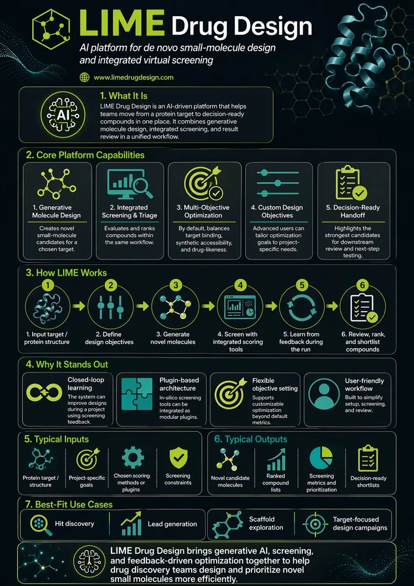
"Three-section layout: top header with key stat, middle with 4 comparison cards, bottom with timeline" structures the infographic before the AI starts rendering.
Include Typography Hierarchy
"Title: 48pt bold black. Stat numbers: 36pt bold accent color. Labels: 14pt regular gray. Source: 10pt italic bottom-right." Clear type hierarchy makes infographics scannable.
Prompt Breakdown
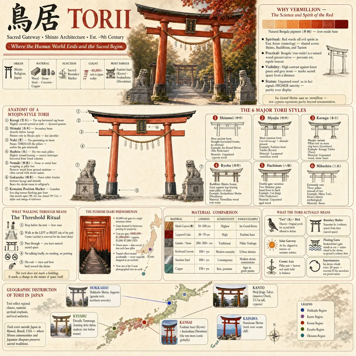
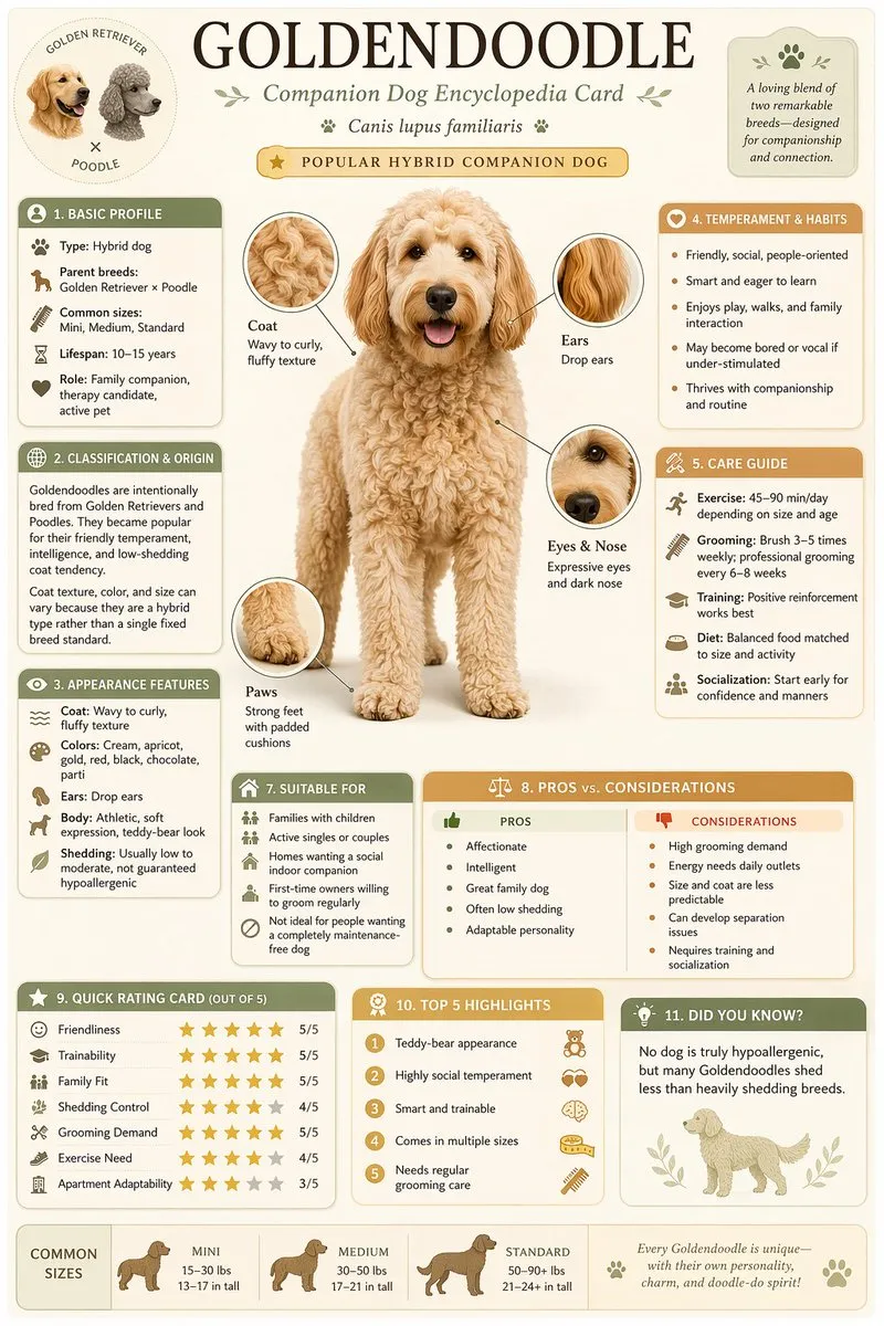
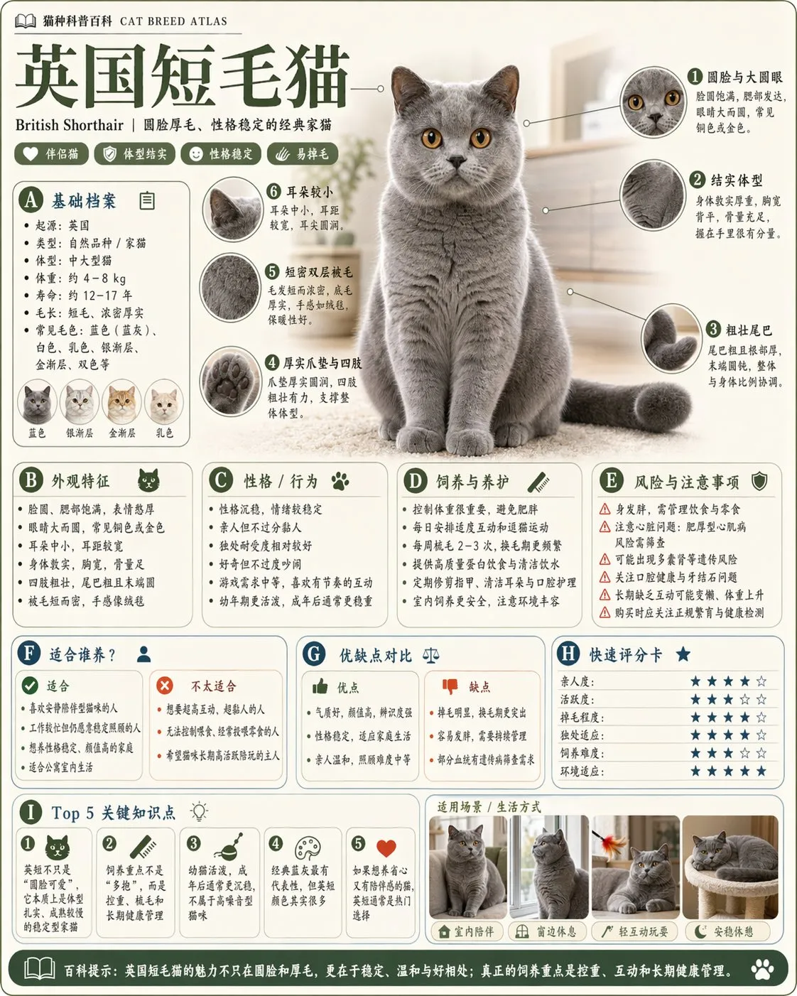
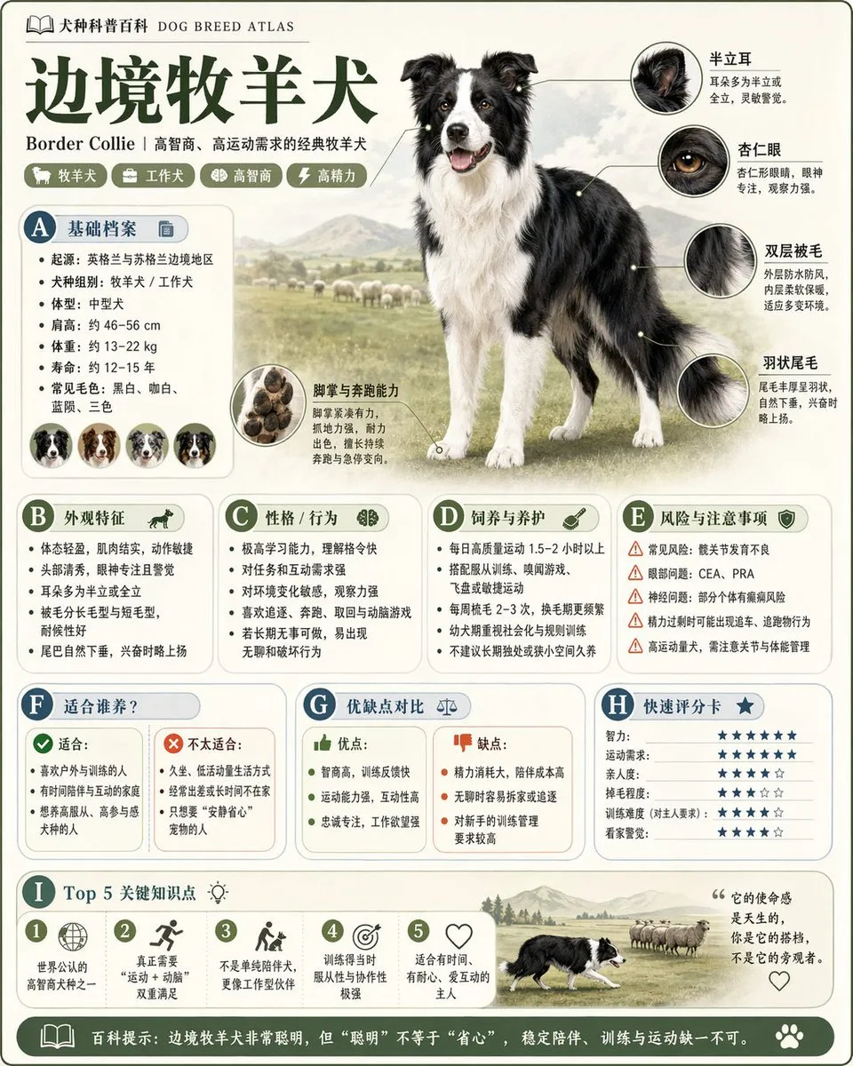
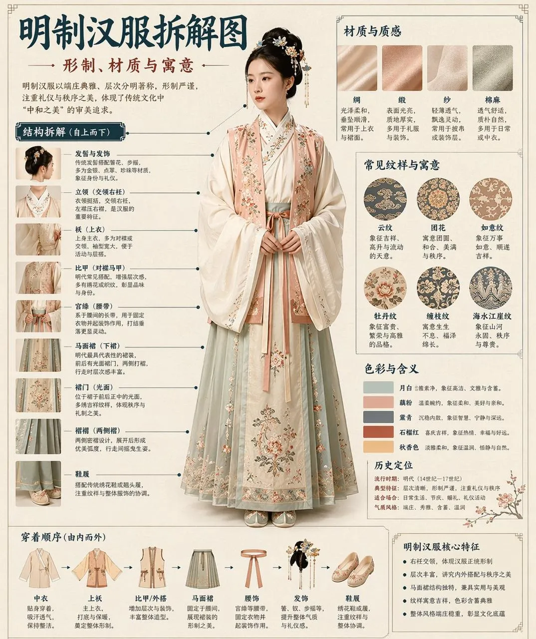
This infographic prompt succeeds by providing structured content (scientific data with clear sections), specifying the layout format (vertical poster with numbered sections), defining visual hierarchy (headers, body text, diagram labels), and establishing an educational tone through color and typography choices.
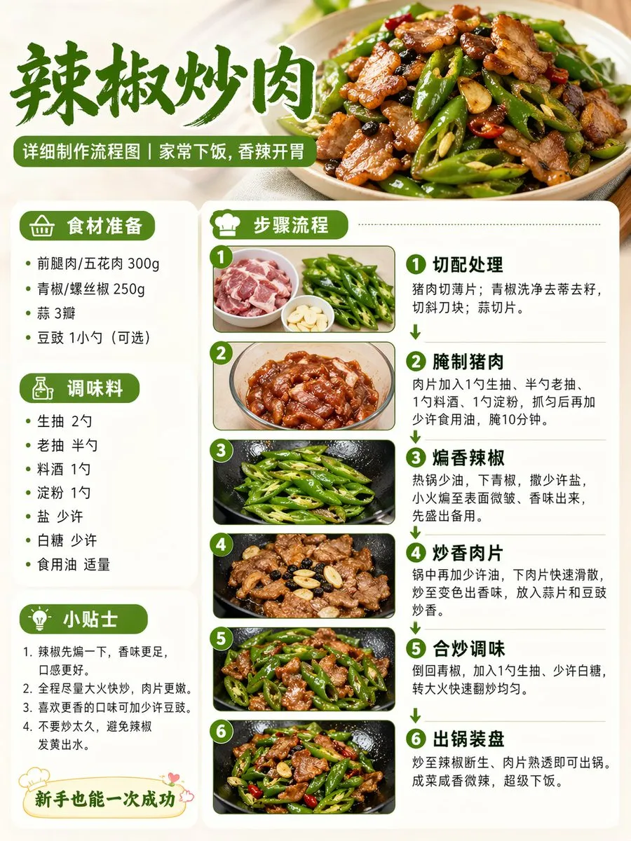
Demonstrates how process-oriented infographics work in AI — by defining sequential steps, specifying flowchart visual language (arrows, boxes, decision points), providing real content for each step, and establishing a cohesive color-coded system for ingredients vs actions.
Best AI Models for Infographic & Data Viz
GPT Image 2 is ideal for infographics thanks to its text rendering accuracy — labels, numbers, and legends render correctly. For more artistic/editorial infographic styles, Midjourney produces beautiful but less precise results.
FAQ — Infographic & Data Viz
Can AI create infographics with accurate data?
AI generates the visual design — you must provide the data. Include exact numbers, percentages, and labels in your prompt. The AI won't research or verify data; it visualizes what you provide.
What makes a good infographic prompt?
Include: the topic/title, 3-6 data points with values, preferred chart type, color scheme, and layout structure. The more structured your input, the more professional the output.
Can AI generate interactive or animated infographics?
AI generates static images only. For interactive visualizations, use the AI output as a design reference and implement it with D3.js, Chart.js, or similar tools. The AI excels at the design direction phase.